


The statistics of energy prices, part 1
Energy markets 101, probability distributions, and density functions

Welcome, energy analysts and math nerds! This is the first of a three-part series on energy price statistics, where we’ll develop a theoretical framework for understanding electricity price data and power plant economics using real data and some fun math.
Today, we’ll introduce some basic characteristics of wholesale power markets and apply some key mathematical concepts which will serve as the foundation for subsequent analysis. Specifically, we’ll cover:
The four power price timescales
Why energy prices are inherently volatile
Characterizing energy markets using probability distributions
In subsequent installments, we will apply what we learn today to analyze the economics of energy generation and energy storage assets.
To keep things simple, we’ll focus our analysis on ERCOT North (Dallas Fort-Worth + surrounding areas), but we will eventually expand our scope to the rest of the country.
Let’s dive in!
The four power price timescales
Grid operators must ensure electricity supply and demand are perfectly balanced, for every second of every day, month, year, decade (century, millennium, etc. etc.). These operators have established a set of four distinct markets to solve this problem, each designed to solve a specific supply/demand imbalance at a particular timescale.
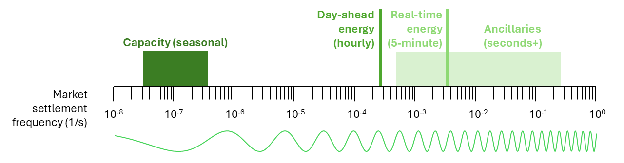
Power prices are simply the outputs of these four market settlements.
Each market has their own nuances, which differ widely across the US, let alone across the world. But the concepts are the same wherever you go.
We’re going to do a deep dive on the day-ahead and real-time energy markets for this series, but if you want to get a complete picture of power plant economics, you’ll need to understand all four markets & revenue streams.
Day-ahead (DA) energy (hourly)
In the day-ahead energy market, each generator places a bid for power for each hour of the following day, 24x7x365.
These bids include quantity (MW) and price ($/MWh). Quantity is usually equal to the maximum possible plant output at that given hour, and price is usually equal to the plant’s marginal cost of operation — the cost it takes to generate one incremental unit of energy.
The operator creates a supply curve by stacking all generator bids together, from lowest to highest price:
This is our marginal cost of supply curve. To break it down:
Wind usually bids in at -$30/MWh, because wind’s marginal cost of production is actually negative, thanks to the PTC1 of -$27.50/MWh.
Solar bids in at -$30/MWh and $0/MWh, because solar can either elect to use the PTC, like wind, or the ITC, in which case the credit is given upfront and the asset’s marginal cost of production is indeed $0/MWh.
Thermal generation, like gas and coal, have positive marginal costs that depend primarily on coal & gas commodity pricing, which can be volatile.
Storage bids are based on individual optimization strategies; for example, batteries bidding at the price cap of $5000/MWh indicate they really don’t want to be discharged during that hour.
There are some notable exceptions here, like nuclear — the nuclear asset in this supply stack is probably bidding in below all those wind & solar assets because they simply can’t turn down their output.
The grid operator forecasts power demand for each hour, and price is determined by the intersection of expected demand with the supply curve and a set of 24 day-ahead energy prices are created.
These prices are calculated at a nodal level — a specific power plant point of interconnection, for example — to reflect the cost of moving electricity within markets. Prices are then aggregated at a zone & hub level which can provide a view of overall market dynamics within a region. Thus, energy prices are also called LMPs (locational marginal prices).
Here, let’s look at the day-ahead energy prices for November 26th, 2024 at the ERCOT North price hub.
Prices peak in the morning and evening, because that’s when demand is high and supply is low.
Let’s look at some peaks and valleys:
At 8:00am, the market cleared at ~$70/MWh. This means that every generator with a bid at or below $70/MWh will dispatch2 and earn revenue, with their profit being equal to the difference between the market clearing price and their bid multiplied by the plant’s output. A solar asset bidding in at $0/MWh would net $70 for that hour, for example, if it output 1 MW. Gas plants bidding in at $25/MWh would net $45/MW.
At 3pm, the market cleared at ~$10/MWh, which means that most gas generation is turned off, with most demand being met by low-cost wind and solar. Similarly, a solar asset bidding in at $0/MWh would net $10 for that hour if it output 1 MW.
This intraday price shape is typical for a late fall day in North Texas. You’ll also see a similar shape in the real-time energy market, albeit with higher volatility.
Real-time (RT) energy (5-minute)
The day-ahead energy market is based purely on forecasted supply and demand, but grid operators also need to match actual supply and demand. This is accomplished, in large part, by the real-time energy market.
Here, the grid operator checks what actual supply and demand is every 5 minutes. Prices are settled again using a similar marginal cost of supply curve, and a set of 288 real-time energy prices are created throughout the day.
You can see that real-time energy follows day-ahead energy, with much higher volatility.
So, to recap:
There are two sets of energy prices, also known as LMPs: day-ahead and real-time.
Day-ahead prices are calculated hourly, and real-time prices are calculated in 5-minute intervals.
These prices are reflective of supply & demand conditions at a specific location (nodal) or within a specific region (zone/hub-level). These conditions are primarily influenced by weather.
If you’d like to read more about electricity markets, Resources for the Future’s electricity markets 101 was personally helpful for me when I was getting started!
Why energy prices are inherently volatile
Energy prices fluctuate dramatically within a single day — even within a single hour. Just in the data we’ve looked at so far, we’re talking about a 10x swing in day-ahead energy within 9 hours and multiple 3-4x swings in real-time energy within a single hour.
This volatility is inherent to the shape of our supply stack.
If you refer back to our ERCOT North supply curve, you’ll see that wind, solar, and lower-cost thermal generation gets you this nice, gently upward-sloping supply curve. Once you approach more expensive peaker plants, though, cost of supply increases and quickly approaches the price cap. As demand oscillates between high and low throughout the day, month, year, etc., prices will vary, too. Moreover, forecast uncertainty introduces additional volatility in the real-time energy market.
Characterizing energy markets using probability distributions
So far, we’ve only looked at energy prices for a single day. What do they look like over the course of a year?
Here are the full set of day-ahead energy prices for ERCOT North in 2024.
You’ll see the overall shape is similar, but now that we’ve expanded our scope to 365 days, we see some outliers — days of low supply & high demand that pushed prices up.
Now, what about real-time energy? If our earlier example was any indication, we should expect the real-time prices to roughly follow day-ahead, with some more volatility.
It looks quite a bit different, doesn’t it?
Firstly, what stands out to me is the extreme asymmetry. Instead of having similar magnitude peaks in both the morning and evening hours, the evening hour price peaks dominate.
Moreover, negative pricing was more common in real-time energy than day-ahead (I know, it’s hard to tell from this scaling, but if you look closely you can see).
Finally, it’s interesting is that there are many price spikes that don’t seem to have been predicted in the day-ahead market, like the 3:00pm spike on November 17th, or the 7:00pm spike on November 10th. This makes sense, though, because it’s impossible to forecast everything in day-ahead.
We can begin to make a bit more sense of this data by creating a couple of histograms.
I’ve normalized the data, because there are 12x as many RT prices as DA prices, so absolute count would give us a disproportionate vertical scale. This means that our histogram is actually a probability density, where the vertical axis is the probability that a price falls in the given range. For example, there was a 6% chance of energy prices being between $20 and $21/MWh in the real-time market, but only a 4% chance in the day-ahead market.
Notably, the distributions are heavy-tailed and slightly skewed. If we plot these in log scale, we see that they become quite symmetrical!
This data makes two probability distributions come to mind: the normal (Gaussian) distribution and the Cauchy distribution. These are described by the following probability density functions (PDFs):
Normal PDF
Cauchy PDF
where p is the probability of encountering price x.
I am going to pick the Gaussian to fit our day-ahead data, and the Cauchy to fit our real-time data. This ultimately comes down to the behavior as x (LMP) approaches zero, as we’ll see soon.3
Just like the histograms we looked at earlier, these are probability density functions that show the likelihood of a price falling within a given range. For example, you can look at the area under the curve from 3 to ∞ (via integration) to find the probability of LMPs being at or above exp(3) = $20/MWh.
These are what the fits look like in regular scale:
Where our lognormal and log-Cauchy distributions are defined as:
Lognormal PDF
Log-Cauchy PDF
using the same parameters as before.
You see the differing behavior as x approaches zero. While the lognormal goes to zero, the log-Cauchy goes to infinity. In fact, it’s interesting that this aligns well with the $0/MWh peak we saw in the actual ERCOT North real-time price distribution. This is the main reason I picked the log-Cauchy for the real-time data.
Speaking of prices going to zero, our fits don’t work for prices below zero. Bummer. This is fine for most markets, but becomes a problem in renewables-heavy regions like CAISO SP15 (Southern California) and SPP (Great Plains). We may be able to solve this by adding a location parameter b to our log distributions, such that ln(x) becomes ln(x - b). In this case, the lognormal might perform well for the real-time data, too.
Part of me thinks a shifted log-normal would better describe both real-time and day-ahead markets, but if we’re going to get into shifted distributions, I think we deserve to dive into negative prices in general. The SP15 and SPP South real-time price distributions are particularly funky and I don’t even think a shifted lognormal would work there. Anyway, this is all beyond the scope of this post, but it’s something I hope to investigate in the future.
A quick recap
To recap, we’ve learned:
The four main types of power markets are capacity, day-ahead energy, real-time energy, and ancillaries, each designed to match electricity supply & demand at a particular timescale.
Day-ahead and real-time energy prices are outputs from a competitive market settlement process where grid operators intersect supply & demand.
Day-ahead and real-time energy prices are volatile due to weather and forecast uncertainty, and can vary significantly within a day and throughout the year.
Energy price distributions are well-modeled by lognormal and log-Cauchy probability density functions despite their limitations, with R² > 0.9.
That’s all for this installment! Please leave a comment if there’s anything you’d like to see in the future. And do subscribe if you’d like to get parts 2 & 3 delivered directly to your inbox.
Part 2 is when we’ll get to the really exciting stuff, where we’ll apply these probability density functions to analyze some basic power plant economics.
Stay tuned!


About the author
I’m a researcher at Wood Mackenzie, one of the world’s leading data and analytics providers for energy. The math presented here comes from my time modeling thermal generation revenues for Fortune 500 utilities and developing my team’s energy storage revenue modeling capabilities. I’ve developed a sort of framework that has become helpful for my work (e.g., curve fitting and computationally cheap modeling). Now that I think it’s reached a critical mass, I’m eager to share what I’ve learned over the past 2-3 years!
Follow me on LinkedIn to see my latest work :)
Production Tax Credit.
Also known as economic dispatch.
No fit is going to be perfect. That said, there are some interesting nuances with Cauchy vs. Gaussian distributions, especially when comparing across markets. I may publish a mini-segment on Cauchies vs. Gaussians for energy prices!
Such an amazing read!
Thank God someone else is talking about electricity markets online--this is a really good explainer of how wholesale power markets work.